
5 Crucial Tips in Creating a Responsive Web Design
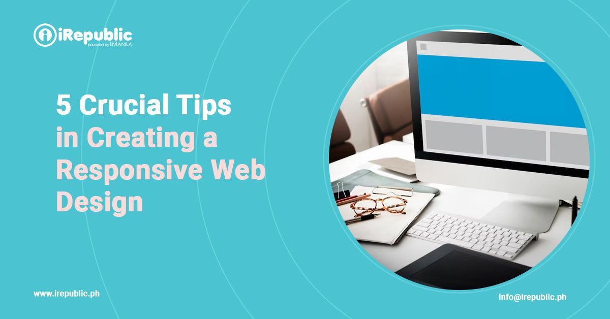
Gone are the days of static websites that only look good on one screen size. With people accessing websites through various devices such as smartphones, tablets, and desktops, a responsive web design is an absolute must-have for achieving online success.
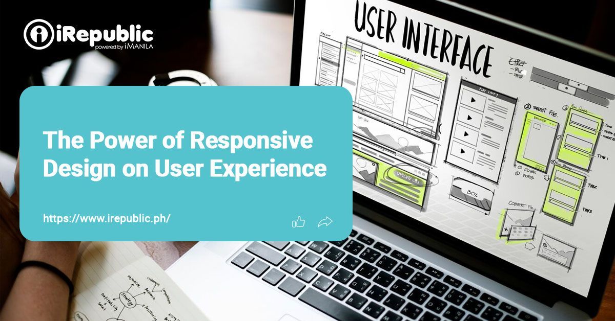
With a responsive design, your website effortlessly adjusts to any device or screen size your user may have. This responsiveness guarantees a flawless user experience, boosting engagement and conversions.
Whether you're revamping your existing site or starting from scratch, read on as we unveil five crucial tips for creating a responsive web design that ensures a seamless user experience across all platforms.
Tip #1: Embrace Mobile-First Approach
Start your responsive web design journey with a mobile-first approach. Focus on creating the mobile version of your site first and then scale it up for larger screens. Since mobile users are rapidly increasing, this approach ensures that your website is optimized for most of your audience. It also encourages a streamlined design that prioritizes essential content, delivering a faster loading time and improved user satisfaction.
Tip #2: Use Flexible Grids and Layouts
Implement fluid grids and flexible layouts in your web design to achieve responsiveness. Instead of fixed-width elements, use relative units like percentages to allow your website to adapt smoothly to different screen sizes. This approach ensures that your content remains easily readable and accessible, regardless of the device's width. Employing a fluid grid system makes your website's design dynamic, making it inherently responsive and future-proof.
Tip #3: Optimize Images and Media
Large images and media files significantly affect your website's loading speed, especially on mobile devices with slower internet connections. Optimize your images and videos to strike the right balance between visual appeal and performance. Use responsive image techniques, such as
srcset attributes or CSS media queries, to serve appropriate image sizes based on the user's screen resolution. Prioritizing image optimization enhances user experience and keeps your website loading swiftly across all devices.
Tip #4: Implement Intuitive Navigation
User-friendly navigation is vital for a responsive web design. Simplify menus and use intuitive icons to ensure easy navigation on small screens. Implement hamburger menus or hidden navigation bars to save valuable screen space. Test the navigation on different devices to guarantee smooth and effortless interaction.
Tip #5: Do Regular Testing and Optimization
Creating a responsive web design is an ongoing process. Regularly test your website on different screen sizes to identify layout or functionality issues. Utilize online testing tools and user feedback to gain insights into potential improvements. We advise you to stay updated with the latest trends and best practices in responsive design, and continuously optimize your website for an exceptional user experience.
In this digital age, a responsive web design is vital in creating an impactful user experience and maintaining a competitive edge. Good thing you no longer need extensive knowledge of complex coding languages like HTML and CSS to build a responsive website. You are set to online success as long as you have an online website builder like
iRepublic that creates websites with mobile responsiveness in mind.
iRepublic, powered by
iManila, is a cheap and easy website builder in the Philippines that can help you create and implement a fully effective, mobile-responsive business website. We have
available website packages from info sites to e-commerce websites with hundreds of
website design templates that you can choose from. Our expertise range from creating a website for businesses and business website design to
digital marketing. Our websites are fully equipped and are also packaged with email hosting - perfect for your small business! Get started on your business’ online journey today.
Contact us now and let’s make your business’ online vision happen!


